Happy New Year everyone. 2016 will see more regular blogging from me, with new art-related (probably) posts at least every Friday. And I’m kicking it off with a review about a new accessory I picked up late last year: Ralph Thomas’ Sketch Wallet.

On July 7, 2015, Ralph Thomas launched a Kickstarter campaign to fund his Sketch Wallet – a wallet designed to carry your cash, cards, and a refillable sketchbook. Suitable for artists on the go that will hopefully encourage them to draw more often, no matter where they are.
As an artist that has a habit of drawing often but a bad habit of not drawing enough, I was intrigued by the notion of combining a wallet with a decent-sized pocket sketchbook. I’d been trying to figure out a way to carry around a pocket sketchbook for years and hadn’t found a solution I liked. I wanted a notebook small enough to carry around with me all the time (not the tiny Moleskine ones, though), quick enough to pull out and put back if I happen to be waiting around a few minutes, and something that didn’t add too much bulk.
On the wallet-side, my favorite wallet that I ever owned was the original Allett, a super-slim wallet made of parachute-grade nylon and had the cards laid out in a foursquare-style design so that two sets of cards faced the other two sets while closed, keeping the wallet thin while it was full of cards. That thing lasted me for years and it was so nice not having a bulky wallet in my back pocket.
I’ve since experimented with a couple other wallets, including another model by Allett and my new black leather Sketch Wallet by Ralph Thomas.
Out Of The Box
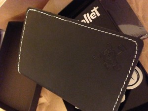
 Upon opening the box, I found the thing to be quite beautiful. Great-looking leather, great shade of black, solid white stitching. Included in the box was a sticker and a small pencil, neither of which I was expecting. There was also a business card in the wallet with what I believe was a thin money clip attached to it (I haven’t used the clip for money, but I tried fastening it onto a sketchbook page and found that I could tear the page if I wasn’t careful. So, I stopped).
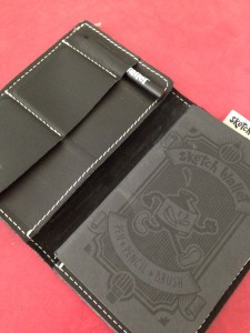
The wallet has a small pocket for the pencil and two card pockets, all laid out in a left-hand vertical column. This sits atop a large flap that serves as the cash pocket and whatever else you need to put in there. The pocket that holds the sketchbook in place can also serve as a place for things like business cards, tickets, etc. On the top of the wallet is a little nylon loop for a pen, should you choose to use it for that purpose.
Impressions
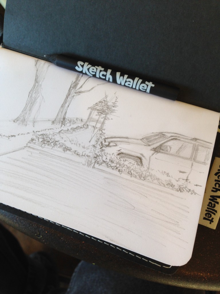
This thing is sturdy. I have no doubts that this Sketch Wallet will last a long time. I also assume that, with time, the leather will age with use, which will give it that old-timey charm that is often associated with worn leather products. And let’s get this out of the way: yes, there’s plenty of room to do a nice, relatively small sketch. You can sketch in it by holding the wallet in your hands, but it’s easier when laying it on a table.
At four inches wide, it certainly fits in my back pocket. But at six inches long, it sticks out, and I don’t like that. At all.
By comparison, I started carrying around a Midori Traveler’s Notebook, Passport Size for bullet journaling, general note-taking, and jotting down story ideas as needed. This notebook, also black leather, comes in at only 4.1″x5.3″. At almost an inch shorter, it fits into my other back pocket quite easily, barely sticking out. In fact, I would imagine that if the Midori notebook weren’t as (relatively) thick as it is, with the three refillable notebooks I’ve added to it, it would stick out even less. I currently use Field Notes-brand notebooks in the Midori, which are 3.5″x5.5″ in size, and the Midori brand refillable notebook that is even smaller, at 3.5″x4.5″. The Field Notes notebooks stick out a tiny bit, but insignificantly.
Its six-inch length also means there’s more wallet to bend if you keep it in your back pocket. The spine bends which, in turn, bends the spine of the sketchbook inside. Compare to my Midori, which allows the spines of the internal notebooks to remain relatively intact.
I imagine that the design of Ralph Thomas’ Sketch Wallet is six inches long because it was the only way to get two card pockets, a pencil pocket, and a decent-sized sketchbook to fit while trying to keep it as thin as possible. And he succeeded. The wallet is really nice. But I think there are improvements to be made.
 First, the pockets. They’re made of leather, and when you’ve got leather pockets stitched onto a leather flap, and the flap is stitched onto the leather wallet body, that’s going to add thickness. Plus, the leather pockets really restrict the number of cards that you can put in them. Switching to this wallet is a bit of a transition if you’re used to carrying around a lot of cards. I’ve done a decent job of paring them down, but that’s also because prior to trying out the Sketch Wallet I was using a different wallet designed to a) be only a wallet, and b) stay as thin as possible no matter what you put in it. Thus, it can be difficult to get cards in and out of the leather pockets; I’ve got about five cards in each slot.
Plus, the leather pockets will eventually mold to the cards you put in them, so if you end up getting rid of cards later on, you’ll have an extra bit of space, which isn’t a good thing in terms of keeps your cards securely in place. To solve this problem, and to make the wallet just a tad thinner, I think it would have been better to sacrifice the extra leather used for the pockets and found some durable elastic nylon, or, like the original Allett design, parachute (or industrial) grade nylon. Sure, the latter type of nylon may eventually conform to your cards, too, but the trade off would be that the wallet could be thinner from the start.
Overall, the Sketch Wallet is definitely thinner than most leather wallets, but not as thin as it probably could be.
Then there’s the pencil pocket. It’s not really necessary. As a leather pocket, keeping the pencil there not only adds bulk, but it stretches out that part of the wallet in such an ugly way. With the pencil in there, the wallet face is no longer flat and smooth. Instead, there’s this bulge that sticks out. No, you can’t use the loop at the top of the wallet because the pencil doesn’t clip in; it’ll just fall out. The loop is best for pens that have a clip.
My understanding is the pencil pocket was placed where it is because putting it in the spine could cause the pencil to break while sitting. This might be (I carry a pen in my other pocket, straight down, and it’s fine), but I think there’s a better way to include the pencil pocket. Either use an elastic band in its place, or get rid of it altogether. People can carry their pencil along side the wallet, parallel to the spine. Yes, this defeats the purpose of having the Sketch Wallet be self-contained, but it’s a small sacrifice to pay for a thinner, less bulky wallet.
Also, by getting rid of the pencil pocket, the wallet could easily come in at five or five-and-a-half inches. The custom sketchbooks would be a little shorter while still matching standard refillable notebook inserts offered by other brands (ie. Field Notes). The other idea would be to offer a reporter-style wallet, one with the spine on top, so that the pencil loop could fit into the spine. This way, the pencil isn’t vertical, and thus not susceptible to potential breaking while sitting.
However, the biggest problem with the Sketch Wallet, as far as I’m concerned, is that fact that even though it’s tall enough to stick out of your pocket, it’s not tall enough to hold cash without folding the bills. Folding bills adds even more bulk, something you really don’t want to do with a wallet of this size. So while the wallet should be shortened, it should also be widened to accommodate a standard wide pocket for cash.
Conclusions
I won’t comment on the price, since this was a Kickstarter and I consider the price to also be a small investment contribution. That said, I think the wallet is a good first version. And it could have a wider appeal for consumers other than artists; since it can house a standard-sized refillable notebook, there’s no reason the wallet couldn’t function as a wallet/notebook hybrid for those wanting a simple notebook on hand.
But, it simply sticks out of my back pocket too much. If I’m not wearing a shirt or jacket that covers it, I’m basically advertising my wallet to the world, and I don’t like that. All the leather is nice but adds bulk, which isn’t good because it already houses a sketchbook. And because you have to fold cash in order to stick it in the cash pocket, the wallet will just get bulkier. This bulkiness just isn’t comfortable to sit on when keeping it in the back pocket. Sure, I could keep it in my front pocket, but all that would do is add a long, bulky accessory to my front pocket instead of my back pocket, and that’s not comfortable or desirable, either.
The first and foremost function of a wallet should be to make sure it’s a great wallet. Any hybrid designs should be built around that purpose. The Sketch Wallet is designed to try and compromise the need for a wallet and a desire for a good-sized pocket sketchbook. It succeeds, but not in the most ideal fashion. It seems to be designed around the sketchbook instead of around a good wallet. I’ve stopped using it for now and have gone back to the original Allett. The only bulky thing I carry is my Midori notebook, which is fine because at least it’s small. I’m sure I’ll have the occasion to use the Sketch Wallet again at some point, but it certainly can’t be my go-to wallet.
That said, the current design is completely usable as it is, and I know some people won’t mind it’s size. There are already many artists using it that seem to really enjoy it. It’s a really good idea, and I look forward to future refinements.
